Week 48: The last week in Italy
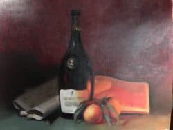
I finished my last week with Davide Barbini with a still life of a wine bottle, oranges, newspaper, my diary and favorite Pelikan ink pen. It was a challenging still life since one side was lit with a blueish white light and the other side with a pinkish-orange light. Of course, this complex light scheme was part of the idea behind this exercise—to learn how to use oil paints to recreate moods and lighting scenes. I learned how to use complementary colors to change the values; alizarin to raise the chroma; and analogous colors to shift the scene subtly.
The still life drawing was done more deliberately given the extra time I had. By carefully crafting the drawing—making sure the shapes and relationships were precise—I was able to more carefully study the shadow shapes and apply the right hue, value and chroma.
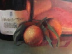
Because of some personal issues in the last week, I was not able to paint the last few days. This meant I was not able to completely finish this final exercise. However, I was able to bring it along to an acceptable level. The earlier sequences are shown in the previous blog post. Here is the state of the still life, with one detail, when I left.
My last week in Florence was bitter sweet. Sweet because these last weeks have included Lea, wonderful visits to Berlin, Venice and Lisbon and fantastic instruction from Amy Florence Mosley and Davide Barbini. Bitter for the obvious reason: its over.
Some of the main learning points:
- The underlying drawing is crucial. It is critical to not rush the drawing. It determine nearly everything. If the relationships, scale and forms are inaccurate—painting will be much more difficult. Correcting during the painting process should be left to refining the drawing—not reworking.
- A complex color palette is not necessary. This painting was done with four major colors: black, white, red and yellow. Since Black is really blue (black is the new blue?) one can make green, for example. In tiny amounts alizarin crimson is used to raise the chroma; viridian green was used to boost the chroma and hue of the green made with black and yellow.
- When rendering a bottle, it is crucial to look at the shapes in the form. These shapes will enable one to create a sense of depth by capturing the interior and surface spaces within the three dimensional form. It is important to remember that each shape is one a curved surface. Even though the shape may appear to be straight it is not. Even a slight exaggeration of the curving line may be required.
- The adjacent colors are as important as the color what is being painted.
- Make sure the shifts in values and hue are aligned with what one actually sees. Remember to watch out for reflected colors–which change the hue of the expected color of the surface. The mind plays tricks—trying to get one to paint what is supposed to be in place rather that what is actually there.
- The way chroma adjusts over the surface of the object must be respected to create the illusion of shape and to reinforce depth.
Recent Comments