Weeks 46 and 47
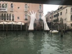
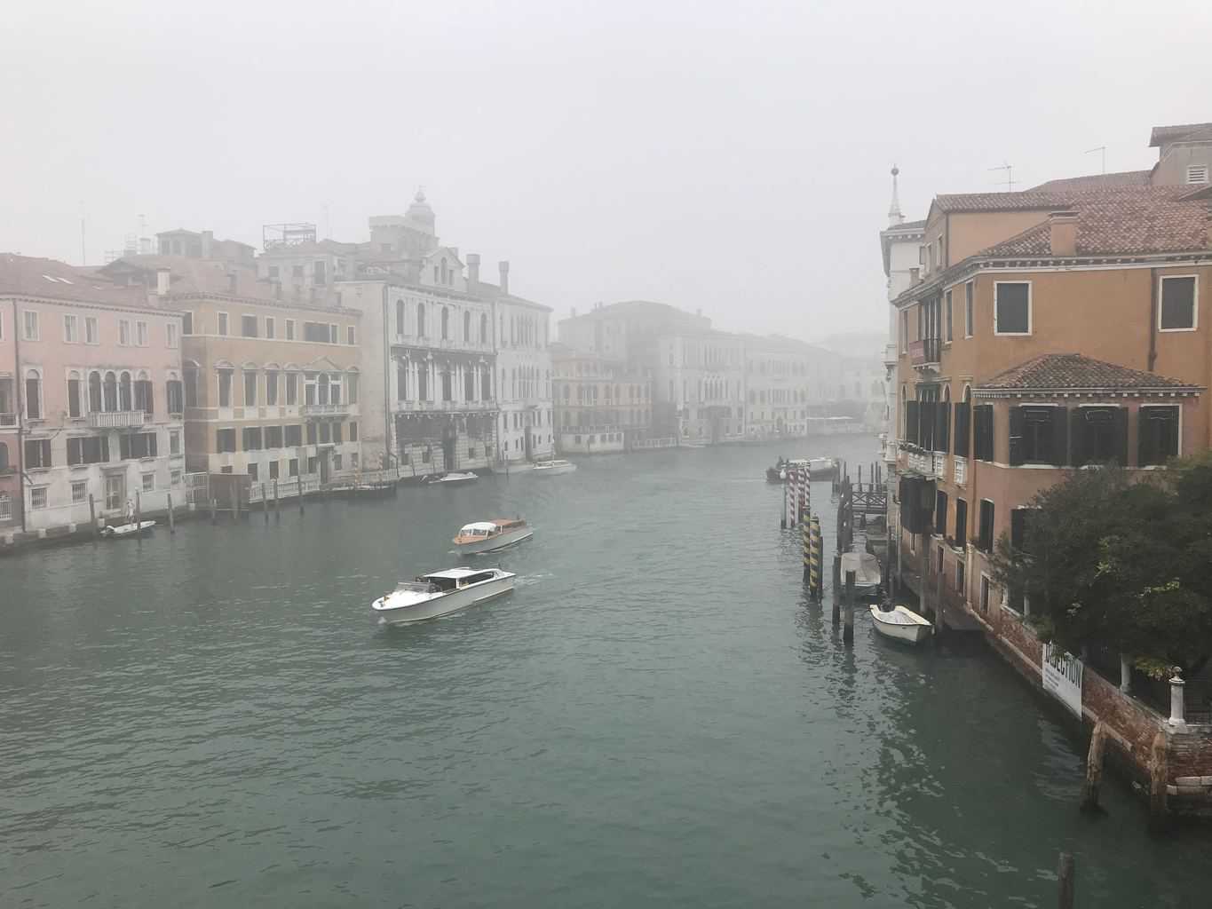
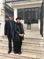
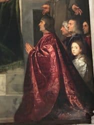
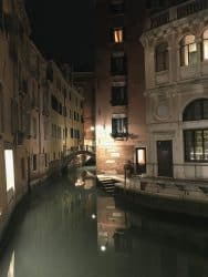
With only three weeks left in my time in Florence, weeks 46 and 47 were packed. We visited Venice and Lisbon on two consecutive weekends. We enjoyed both cities immensely. Seeing the Tintoretto and Titian painting in Venice was especially invigorating. It was also very pleasant to travel out of season. Lea and I are not especially found of fighting the masses for a good view, dinner table or sidewalk real estate. It was fun to meet Chiara Barberi, who is heads of the Venice Biennale space (managed by the Guggenheim in Venice) and publications. She is a friend (and former employer of our friend Jackie Ivy at Nike.)
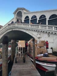
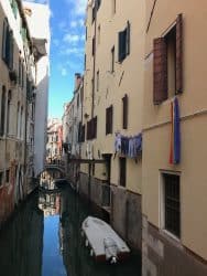
We spent a long weekend in Venice. Lea’s last trip there was in 1971; mine in 1998. The weather cooperated. It was nice that there were relatively few tourists. We both decided that cooler temperatures are a great trade-off for masses of folks skimming the surface of one of the greatest cities on the planet. Our itinerary was suggested by one of my art treacheries, Davide did his Barbini—who completed his masters at the Art Academy in Venice.
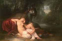
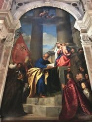
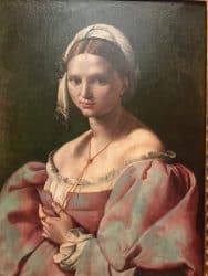
- Basilica di Santa Maria Dei Frari—where we saw the Assumption by Titian.
- Scoula Grande di San Rocco—where we saw 65 paintings by Tintoretto, painted over a 20-year period.
- Ca’ Pesaro with its Oriental and XIX-XX Paintings
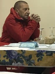
- Peggy Guggenheim Collection where we were greeted by Chiara Barberi, in charge of publications and the Biennale
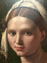
- Galleria Academia—home to over 800 15th-16th paintings.
- Santa Maria Della Salute, a prime example of Venetian Baroque
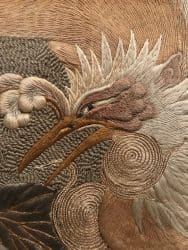
- Palazzo Fortuny which had a wonderful exhibit called “Intuition.”

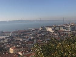
Here are some highlights of Lisbon. The Gulbekian Museum was especially rewarding. We have definitely added Portugal to our return-to bucket list.
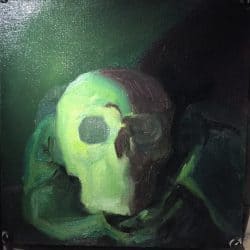
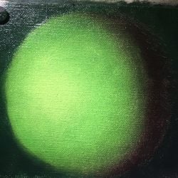
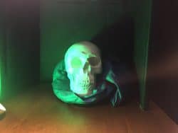
My work with Davide Barbini is ramping up to an intense level as I complete my studies for 2017. Week two with Davide began with understanding analogous color. The first exercise was painting a memento mori in green. I did not have time to finish the painting completely but did begin to understand the modeling of the skull and its close relationship to modeling the sphere. One of the more important things I have learned is too look beyond the physicality of the object and understand its basic geometry. I also am more fully recognizing my tendency to move too quickly to detail. Another interesting aspect of this study is the revelation that I tend to focus too quickly on the surface. I have begun to learn to look beyond the messages conveyed by surface modeling and detail and better understand the organizing forms. This, more than anything, will inform the way one turns the form and applies the paint to support this underlying geometry and the ambient lighting condition.
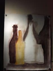
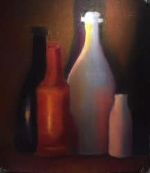
The second exercise proved to be a real test. This was a still-life painting of 4 colored bottles. While I could understand the rendering and lighting, getting the bottles symmetrical was extremely hard. Being right-handed, the left side of bottle was closer to the sweeping form of the bottle. The right-hand side was tricky and, after many attempts, I still was not able to reach perfect symmetry. It was, despite this, a terrific exercise and one that I want to tackle again. I love the feeling of pushing myself into new territory—and I especially like the feeling when I conquer (even if only partially) the new tests.
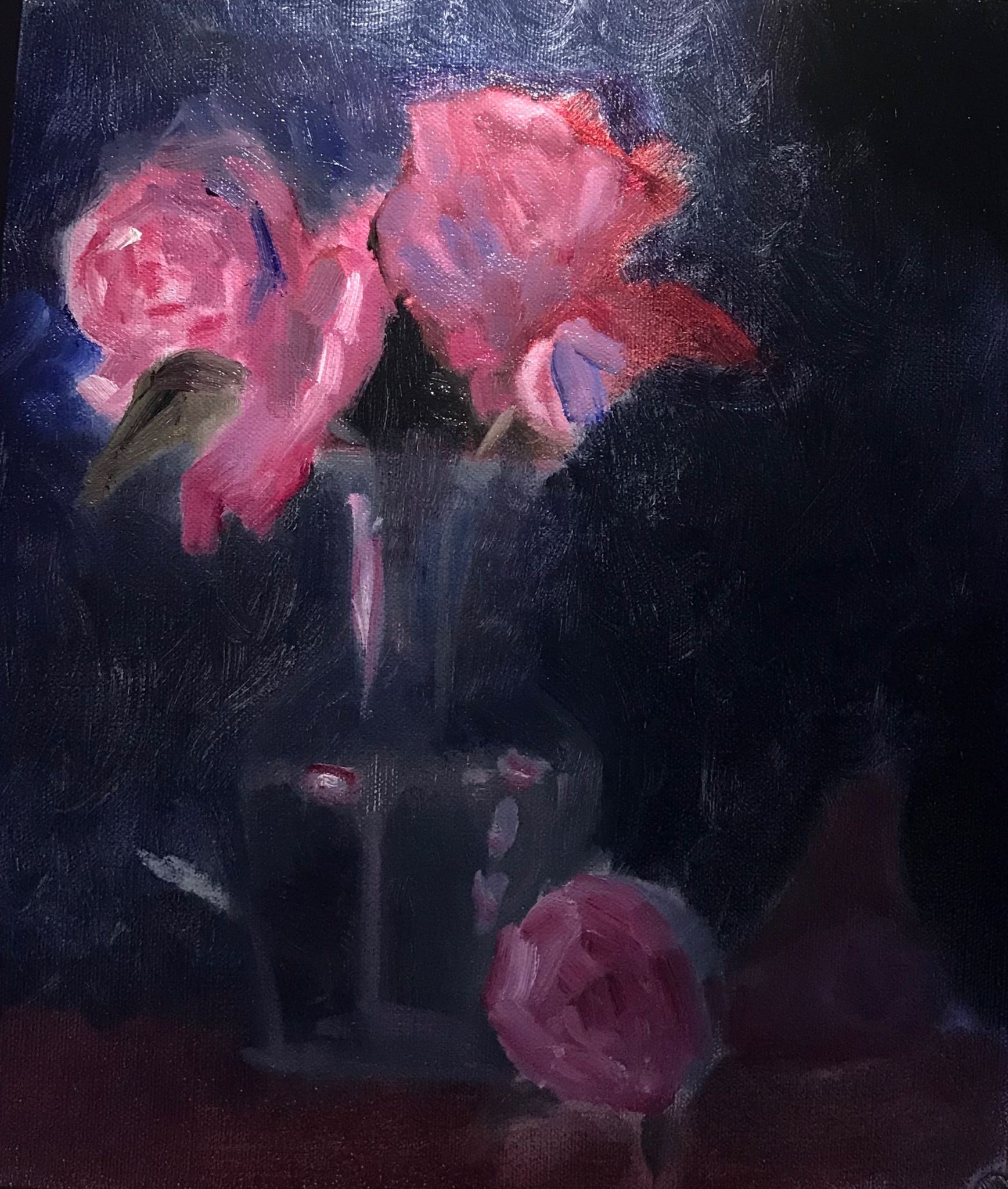
The final quick study was a vase with flowers. Like the bottle exercise, I was not able to complete this study. Since it was limited to three hours, I had to work fast. This meant that I was forced to work flying blind. All-in-all I did grasp the concept and look forward to tackling flora again. Each flower is, first and foremost, a lit sphere. The critical part of the exercise to not forget that the overall spherical form must turn—an essential element to giving depth and definition to the shape of each flower. Only after this is finished can the next layer, the pedals, be inserted. To further complicate things, each pedal is, in its own right, a segment of a sphere. So—there are two things going at once. The overall form of the flower and the way the light falls on the individual pedal. To further compound things, there is refracted and reflected light. Needless to say, once one tries this exercise their appreciation of the Dutch 16th century naturalist painters skyrockets.
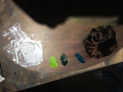
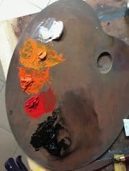
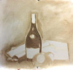
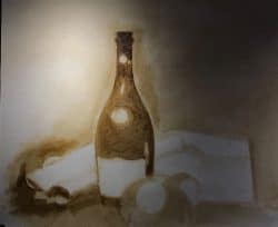
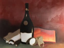
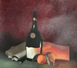
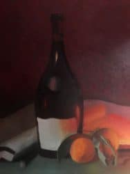
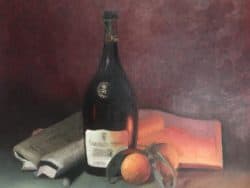
The final, nine day exercise is a still life with a bottle, diary, paper, tangerines and my favorite Pelikan Fountain pen. Since this is a 40 hour plus painting exercise, I am able to slow down, and think about and more carefully create the underlying drawing. The palette is simple. White (titanium white with calcium carbonate), cadmium yellow, red and orange and ivory black. The the yellow is then toned down with the orange. When painting the green table table, a bit of viridian was added to the green (black+yellow). The sketches were drown with raw umber. A tiny bit of Alizarin crimson—a red color that is biased slightly more towards purple than towards orange on the color wheel. It is named after the organicdyealizarin, found in the madder plant, and the related synthetic lake pigmentalizarin crimson (PR83 in the Color Index). References from Wikipedia.
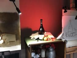
The bottle was equally as challenging–but since I had more time I was able to focus more clearly on creating a better drawing. This painting will be completed in my final week (#48).
The lessons learned:
- Remember to keep the basic shapes in mind when establishing the “big picture” turning of the form. In the case of the skull—it is simply a sphere.
- The first decision is to establish the local color—in this case it is a light green with a yellow cast. This color will be used to set the chroma.
- The first exercise is to establish the value range by first painting the darkest darks (in this case the cast shadow on the backdrop. They the darker ranges but still the lightest darks. After these are set, the darkest dark on the form (the shadow on the skull) is set with a color made up of the lightest light and the high chroma complementary color (in this case Alizarin Red).
- Once these are painted, the form is best described by painting in the lightest areas. The lighter the area on the painting, the more opaque the paint. The darker the areas, the more transparent.
- Modeling is done with transition colors made from the lights and the darks. Remember to keep the chroma high in the highlight and let chroma transition towards the shadows. Within the shadows, the chroma will be duller at the transition point and then increase towards to far edge.
- When creating the sphere:
- Establish the darks first
- Paint the shadow with the lightest color darkened with the Alizarin Red
- Establish 3 color ranges—light (1), mid-tone (2) and dark (3) using three separate brushes—along with (4) the shadow.
- To blend, always go from 1>2, 2>3, 3>4 and back-and forth. Never go, for example, from 1>3. Keep the brush and palette clean.
Recent Comments